New logo
Freshfields has unveiled a rebranding, dropping ‘Bruckhaus Deringer’ from its name as part of the refresh.
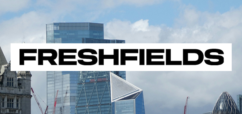
The Magic Circle firm’s rebrand, which rolls out across the firm from next month, includes a bold new black-and-white, all-caps logo featuring the firm’s name (pictured top).
Commenting on the launch, Freshfields senior partner Georgia Dawson said:
“Our refreshed brand is dynamic and bold, reflecting the entrepreneurial spirit of Freshfields today and our momentum as a firm. With our 280-year history, we continue to operate at the forefront of law, setting new standards, giving our clients the edge in achieving their objectives, and attracting the best talent across the world.”
“We want our brand to reflect who we are wherever people encounter us and bring our strategy to life as we continue our next chapter of growth,” she continued. “One reflection of that is our shortened name that embraces the reality of what people call us in the market and how we refer to ourselves.”
Freshfields is the oldest Magic Circle firm, with roots dating back to 1743. In 2000, it adopted its current name after merging with the German firm Deringer Tessin Herrmann & Sedemund and the German-Austrian firm Bruckhaus Westrick Heller Löber.
The Legal Cheek Firms Most List 2025 shows Freshfields is one the largest trainee recruiters in the City with an annual TC offering of around 90. It’s also one of the top paying firms, with newly qualified associates earning a salary of £150,000.